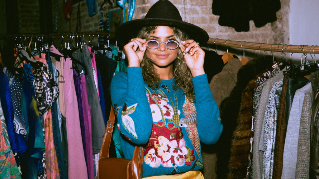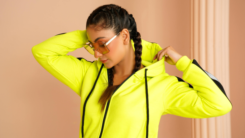
Wearing bold colours confidently is about understanding how to balance vibrancy with style. Choosing colours that complement your skin tone and pairing bold shades with neutral pieces allows anyone to create striking yet wearable looks. This approach helps avoid feeling overwhelmed and makes adding colour to an outfit approachable.
Developing confidence with bold hues involves starting small, such as incorporating a single bright item or accessory. Over time, experimenting with patterns and colour clashing can add more personality to a wardrobe while maintaining a polished appearance.
Mastering bold colours is a skill that enhances personal expression and style impact. It requires practice and a willingness to explore different combinations, but with the right techniques, anyone can make vivid colours a natural part of their everyday fashion.
Understanding Bold Colours
Bold colours are defined by their intensity, saturation, and the visual impact they create. Their effects extend beyond appearance, influencing mood and perception. Recognising these factors helps in selecting and styling bold colours effectively.
What Makes a Colour Bold
A bold colour is one that displays high saturation and brightness, making it immediately noticeable. These colours stand out against muted or neutral shades due to their rich, vibrant tones.
Boldness is not just about hue but also the depth and purity of the colour. For example, a bright red or a vivid cobalt blue is considered bold because it commands attention without blending into the background.
The contrast between bold colours and softer or neutral colours is key to their effective use. When balanced correctly, bold colours enhance an outfit without overwhelming it.
Psychological Impact of Vibrant Colours
Vibrant colours often evoke strong emotional responses. Colours like red can stimulate energy and confidence, while yellow tends to convey optimism and warmth.
Understanding these psychological effects helps in choosing bold colours that align with desired moods or occasions. For instance, wearing bold blue might project calm authority in business settings.
Bold colours can also affect how others perceive the wearer, signalling traits such as creativity or assertiveness. This adds an expressive layer to fashion choices beyond aesthetics.
Popular Bold Colour Examples
Common examples of bold colours include:
- Red: Symbolises passion and power.
- Electric Blue: Associated with confidence and modernity.
- Bright Yellow: Evokes cheerfulness and attention.
- Emerald Green: Represents freshness and vitality.
- Fuchsia: Expresses energy and uniqueness.
These colours often serve as focal points in an outfit, whether in clothing, accessories, or makeup. Pairing them correctly with neutrals or complementary colours helps maintain balance and avoids visual clutter.
Building Confidence to Wear Bold Colours
Wearing bold colours requires more than just picking bright clothes. It involves understanding personal preferences, addressing fears, and gradually pushing boundaries. Developing confidence in this area comes from practical steps and a clear mindset.
Overcoming Colour Anxiety
Many people hesitate to wear bold colours due to fear of standing out or making mistakes. This anxiety often stems from unfamiliarity with pairing bright shades or worrying about others’ reactions.
To overcome these concerns, starting with small accents like accessories or a single bold piece helps. It reduces the pressure while introducing vibrancy. Learning which colours suit one’s skin tone also builds trust in colour choices.
Focusing on how the colours make one feel rather than others’ opinions shifts the mindset towards self-expression. Practising bold colour wearing in comfortable settings can ease anxiety over time.
Embracing Your Personal Style
Confidence grows when bold colours align with personal style rather than feeling forced. Identifying colours and patterns that resonate with one’s personality makes the experience authentic.
He or she should review their wardrobe to find bold items that match usual style elements, such as classic cuts or preferred colour families. Mixing bold pieces with familiar styles creates a cohesive look that feels natural.
Personal style is also about comfort. When someone feels physically and visually at ease in bright colours, confidence strengthens. Experimentation within style boundaries encourages a sense of ownership over colour choices.
Tips for Stepping Out of Your Comfort Zone
Progressive steps help to incorporate bold colours confidently. Here are practical tips:
- Pair bold colours with neutrals like black, white, or beige to balance vibrancy.
- Try colour blocking with two bold but complementary shades for an intentional statement.
- Start with bold accessories such as scarves, shoes, or bags to add pops of colour gradually.
- Use prints and patterns that include bold colours but maintain some neutral elements.
- Seek feedback from trusted friends for reassurance and style advice.
Consistent practice and mindful selection foster confidence, turning bold colours into a natural extension of the wardrobe.
Choosing Bold Colours That Suit You
Choosing bold colours involves understanding how different shades interact with skin tones, personal features, and overall style. This process begins with identifying underlying skin tones, exploring seasonal colour types, and carefully selecting hues that enhance natural characteristics without clashing.
Determining Your Skin Undertone
Skin undertone is a subtle hue beneath the surface that affects how colours appear next to the skin. There are three common undertones: cool, warm, and neutral.
To determine undertone, observe the veins on the wrist. Blue or purple veins often indicate a cool undertone. Greenish veins suggest a warm undertone. A mix of both may point to a neutral undertone.
Other methods include noticing which jewellery suits best: silver flatters cool tones, while gold complements warm skin. Those with neutral undertones can usually wear both metals well.
Understanding undertones helps prevent choosing bold colours that clash or wash out the complexion.
Seasonal Colour Analysis
Seasonal colour analysis groups people into categories based on their hair, eye, and skin tones. The four main categories are Winter, Summer, Autumn, and Spring.
- Winter and Summer are cool seasons. Winters can wear vibrant hues like royal blue and emerald. Summers suit softer shades like lavender and powder blue.
- Autumn and Spring are warm seasons. Autumns look strong in earthy tones such as burnt orange and olive. Springs shine in bright, warm colours like coral and teal.
Knowing your season guides the selection of bold colours that will enhance natural colouring rather than overpower it.
Selecting Flattering Hues
Once the undertone and season are known, selecting specific shades becomes easier. Individuals with cool undertones benefit from bold blues, purples, and jewel tones. Warm undertones work well with bold reds, oranges, and yellow-greens.
It is best to balance bold colours with neutrals in an outfit. For example:
| Undertone | Recommended Bold Colours | Neutrals to Pair With |
| Cool | Sapphire, Amethyst, Emerald | Charcoal, White, Navy |
| Warm | Ruby, Coral, Mustard | Beige, Chocolate, Cream |
| Neutral | Mix of muted and vivid hues | Taupe, Grey, Soft White |
Choosing one statement bold piece and keeping other elements simple ensures the colour complements without overwhelming.
Styling Outfits with Bold Colours
Wearing bold colours requires thoughtful coordination to avoid clashing or overwhelming the outfit. Effective styling involves controlling the visual impact through strategic placement, pairing, and contrast. Understanding how to balance statement pieces, combine hues, and use neutrals helps create outfits that look intentional and polished.
Balancing Statement Pieces
When incorporating bold colours, one item should take visual precedence. A single bright jacket, blouse, or pair of trousers can serve as a statement piece without competing with other strong colours.
Keeping the rest of the outfit simple allows the bold item to stand out. For example, pairing a vibrant red blazer with classic black or navy separates ensures the focus is clear. Overloading with multiple bold items risks confusion and leaves the outfit feeling chaotic rather than confident.
Accessories such as shoes, belts, or bags can feature subtle hints of colour to complement the main piece without creating visual clutter. This controlled approach keeps outfits balanced and approachable while still showcasing boldness.
Mixing and Matching Vibrant Tones
Combining vibrant colours requires a careful eye for harmony. Pairing colours that sit opposite on the colour wheel (complementary colours) can create striking but balanced looks—think cobalt blue with burnt orange or emerald green with magenta.
Analogous colours, or those next to each other on the wheel like yellow and green, offer a smoother, less jarring transition. Using colour blocking by pairing blocks of solid bold colours with clean lines can amplify impact without chaos.
Patterns can be integrated too, but it is crucial that they share at least one bold colour from the outfit to maintain coherence. The key is intentional mixing to ensure each colour supports rather than competes with the others.
Pairing Bold Colours with Neutrals
Neutral shades anchor bold colours and reduce visual tension. Whites, blacks, greys, and beige tones provide a background that allows bold colours to pop without overwhelming.
A bold top with neutral trousers or a vibrant skirt with a classic white shirt results in a sophisticated yet noticeable style. Neutrals can also soften the transition between multiple bold pieces when layered.
Using neutrals strategically—for example, in shoes or outerwear—adds versatility and tonality to the outfit. This practice builds a bridge between daring and wearable, ensuring the bold colour remains the primary focus.
Accessorising with Bold Colours
Bold colours can transform accessories into striking focal points or subtle enhancements within an outfit. Selecting the right pieces and balancing their vibrancy with other elements is key to maintaining confidence and style. Accessories that command attention should complement the overall look without overwhelming it.
Choosing Statement Accessories
When opting for statement accessories, it is important to consider scale and colour harmony. Large, colourful earrings or chunky bracelets in vibrant reds, blues, or yellows can emphasise personality, but must be balanced with simpler clothing to avoid clashing.
Materials also play a role—metalwork like engraved silver or gold can add sophistication while still maintaining boldness. Patterns such as playful prints or unusual shapes enhance interest without being overpowering.
Tips for choosing statement accessories:
- Pick one focal piece per outfit
- Match bold hues with neutral tones to ground the look
- Opt for clean lines or geometric shapes to keep the style modern
Confidence is essential; wearing a statement piece with assurance elevates the entire ensemble.
Integrating Bold Shoes and Bags
Bold shoes and bags offer versatile ways to inject colour into an outfit while remaining functional. A bright handbag, such as a red satchel or cobalt blue clutch, can add a pop of colour without dominating the look. Similarly, shoes in vivid shades should complement or contrast thoughtfully with the colour of the clothing.
To avoid a chaotic appearance, pairing bold shoes or bags with neutral or monochrome clothing helps create visual balance. Textures and finishes also matter—matte leather or smooth patent can change the effect of a bold colour.
Effective strategies for integrating bold shoes and bags:
- Use accessories to punctuate an otherwise subdued outfit
- Select shapes and sizes that fit the occasion and outfit style
- Coordinate with other accessories, but avoid matching them exactly
Careful placement of bold-coloured shoes and bags allows for striking yet tasteful fashion statements.
Incorporating Patterns with Bold Colours
Balancing patterns with bold colours requires careful selection to avoid visual clutter. Skillfully mixing prints and vivid hues can enhance an outfit’s sophistication and vibrancy when done with intention. Attention to scale, colour harmony, and placement plays a crucial role.
Using Prints Tastefully
Choosing prints that complement rather than compete with the bold colour is essential. Opt for patterns within the same colour family or those featuring subtle hues paired with the bright tones. For example, a floral pattern in soft blues and greens can work well with a bold blue garment.
Limiting print coverage helps maintain balance. Incorporating prints in accessories or one statement piece instead of an entire outfit prevents overwhelming the eye. Small touches like scarves, bags, or shoes with restrained prints can add interest without distraction.
Understanding print scale is important. Large, bold prints demand more restraint elsewhere, while delicate or smaller patterns allow for slightly bolder colour pairings. The right choice enhances the outfit’s cohesion and polish.
Combining Patterns and Brights
When using bright colours alongside patterns, balance is critical. Pairing a vibrant colour with a monochromatic patterned piece creates a cohesive look. For instance, a vivid red blouse may be styled with black-and-white geometric-patterned trousers, maintaining focus on the colour.
Mixing patterns and bright colours must consider undertones. Warm undertones in the print should complement warm bold shades, and cool undertones suit cool colours. This alignment avoids visual conflict and ensures harmony in the ensemble.
Layering thoughtfully enhances the effect. A bright solid colour can act as a backdrop to patterned layers, or vice versa. Accessories in neutral tones help to ground the look, providing visual breathing space between bold colour and intense prints.
Styling Bold Colours for Different Occasions
Wearing bold colours requires adjusting the intensity and pairing to suit each setting. Attention to fabric, cut, and accessory choices ensures colours remain appropriate and flattering across casual, professional, and formal contexts.
Casual Daywear
For casual looks, bold colours can be energising and playful. Pair a bright top or jacket with neutral bottoms like denim or beige chinos to anchor the outfit.
Accessories should be minimal to avoid clashing with vibrant hues. Wearing one statement piece in a bold colour, such as a red sweater or yellow trainers, keeps the outfit balanced.
Colour blocking works well here, mixing two or three bold shades with complementary undertones. Choosing softer fabrics like cotton or lightweight knits keeps the look approachable and relaxed.
Workplace Appropriate Outfits
In professional environments, bold colours must be integrated thoughtfully to maintain a polished appearance. Opt for tailored pieces in deep or muted tones such as burgundy, emerald, or navy instead of neon or overly bright shades.
Combining a brightly coloured blouse with a neutral blazer and trousers provides a sophisticated contrast. Alternatively, use bold accessories like scarves or ties to add interest without overwhelming the outfit.
Structured silhouettes and quality fabrics elevate bold colours, ensuring they convey confidence and professionalism rather than distraction.
Evening and Event Styling
Bold colours for evening events offer an opportunity to make a statement, provided the styling is refined. Rich, jewel tones in satin or velvet fabrics are ideal choices for dresses or suits to maximise impact.
Mixing a bold colour with metallic accessories or subtle patterns adds depth without complexity. Wearing monochrome in a single vibrant shade can also create a striking, cohesive look.
Balance is key; pairing strong colours with minimal jewellery and classic shoes ensures the focus remains on the colour itself and the event’s formality.
Maintaining Balance and Proportion
Wearing bold colours effectively requires thoughtful pairing and styling to avoid visual overwhelm. Achieving harmony in layers and matching pieces to body shape ensures a polished and confident look.
Layering Techniques
Layering with bold colours works best when contrasted with more neutral or subdued tones. For example, a bright blouse under a neutral blazer can make the colour pop without dominating the outfit.
Using one bold piece as the focal point while keeping other layers simple maintains balance. Mixing textures like a smooth jacket over a vibrant, patterned top adds dimension without cluttering the look.
Accessories in neutral shades or subtle patterns can break up bold colour blocks. This method prevents the outfit from appearing too busy or heavy and helps each layer stand out clearly.
Proportion Tips for All Body Types
Proportion plays a key role when incorporating strong colours. For shorter heights, wearing bold colours in smaller or vertical segments helps elongate the appearance. Larger colour blocks on shorter frames may overwhelm.
For taller or broader builds, bold colours can be used more generously. Pairing a bright top with darker bottoms draws the eye upwards, emphasising the upper body.
People aiming to minimise certain areas should wear darker colours on those sections and reserve bold hues for features they want to highlight, such as the upper half or accessories near the face. This targeted approach creates a flattering balance.
Caring for Bold Colour Clothing
Proper care preserves the appearance and vibrancy of bold-coloured garments, ensuring they stay sharp and fresh for longer. Attention to washing methods and storage can significantly extend the life of bright fabrics.
Washing and Storing Bright Garments
Bright clothes should be washed inside out to reduce colour fading and abrasion. Cold water washing is recommended, as hot water breaks down dyes more quickly. Using a gentle detergent formulated for colours helps maintain the fabric’s vibrancy.
Avoid overloading the washing machine; crowded items release more lint and create friction. Air drying in the shade prevents sunlight from dulling colours, while tumble drying can cause shrinkage and colour loss.
When storing, keep bright items away from direct sunlight and fluorescent lighting to minimise fading. Folding instead of hanging can prevent fabric stretching, especially for knits or delicate materials. For long-term storage, using breathable garment bags protects clothes from dust without trapping moisture.
Maintaining Colour Vibrancy Over Time
Regularly refreshing bold colours requires careful routine and occasional treatments. Using colour-depositing detergents or fabric conditioners designed for bright fabrics can help sustain richness.
Spot cleaning stains immediately reduces the need for frequent washes, preserving colour intensity. Ironing inside out on a low setting prevents shine damage on saturated hues.
Rotating bold-coloured pieces in the wardrobe limits wear and reduces overexposure to environmental factors. Avoiding harsh chemicals like bleach or strong stain removers ensures dyes aren’t stripped away.
Consistent care of washing, storing, and handling will keep bold colours looking vibrant and fresh through multiple wears and washes.
Inspiration and Staying Updated
Keeping inspiration fresh and knowing what’s current can help maintain bold colour choices that feel modern and personal. Drawing ideas from established fashion figures and understanding trends in colour use ensures a wardrobe remains relevant and confident.
Following Fashion Icons
Fashion icons serve as practical guides for wearing bold colours successfully. They often demonstrate how to balance bright hues with neutrals or how to combine different textures and shades within a single outfit.
Observing how icons adapt bold colours to various occasions can provide valuable cues for everyday styling. For instance, some might pair a striking colour like emerald green with simple accessories, while others may choose monochromatic looks to emphasise sophistication.
Following these figures on social media or fashion publications offers ongoing examples of confident colour use. This steady exposure helps internalise styling strategies and can inspire experimentation suited to individual tastes and skin tones.
Exploring Current Trends in Colour
Staying informed about current colour trends enables individuals to incorporate fresh, fashionable shades into their wardrobe with confidence. Trend reports often highlight seasonal colour palettes and popular combinations, simplifying the selection process.
Trends can also indicate the best ways to wear bold colours, such as mixing unexpected hues or embracing colour blocking. Understanding which colours dominate forecasts—like vibrant reds or pastel blues—helps in making choices that feel contemporary rather than outdated.
Practical tools include colour guides and apps that update seasonally. These resources assist in building harmonious outfits and encourage stepping beyond comfort zones while maintaining visual cohesion.